Customer versions
Account pricing, onboarding and support content for signed-in customers, on the same address as the public page.

VectorCanvas brings together your public site, an investor Deal Room and a Customer Room for every account. You can build it in the visual editor, with your own AI through the VectorCanvas MCP, or both, and either way you end up with the same editable site.
Most founders already have a favorite model and months of conversations with it about the business, so VectorCanvas gives that model the instructions it needs to work on your site.
Any assistant that supports remote MCP servers can connect. You approve each connection, and you choose whether it can read your site, change drafts or publish.
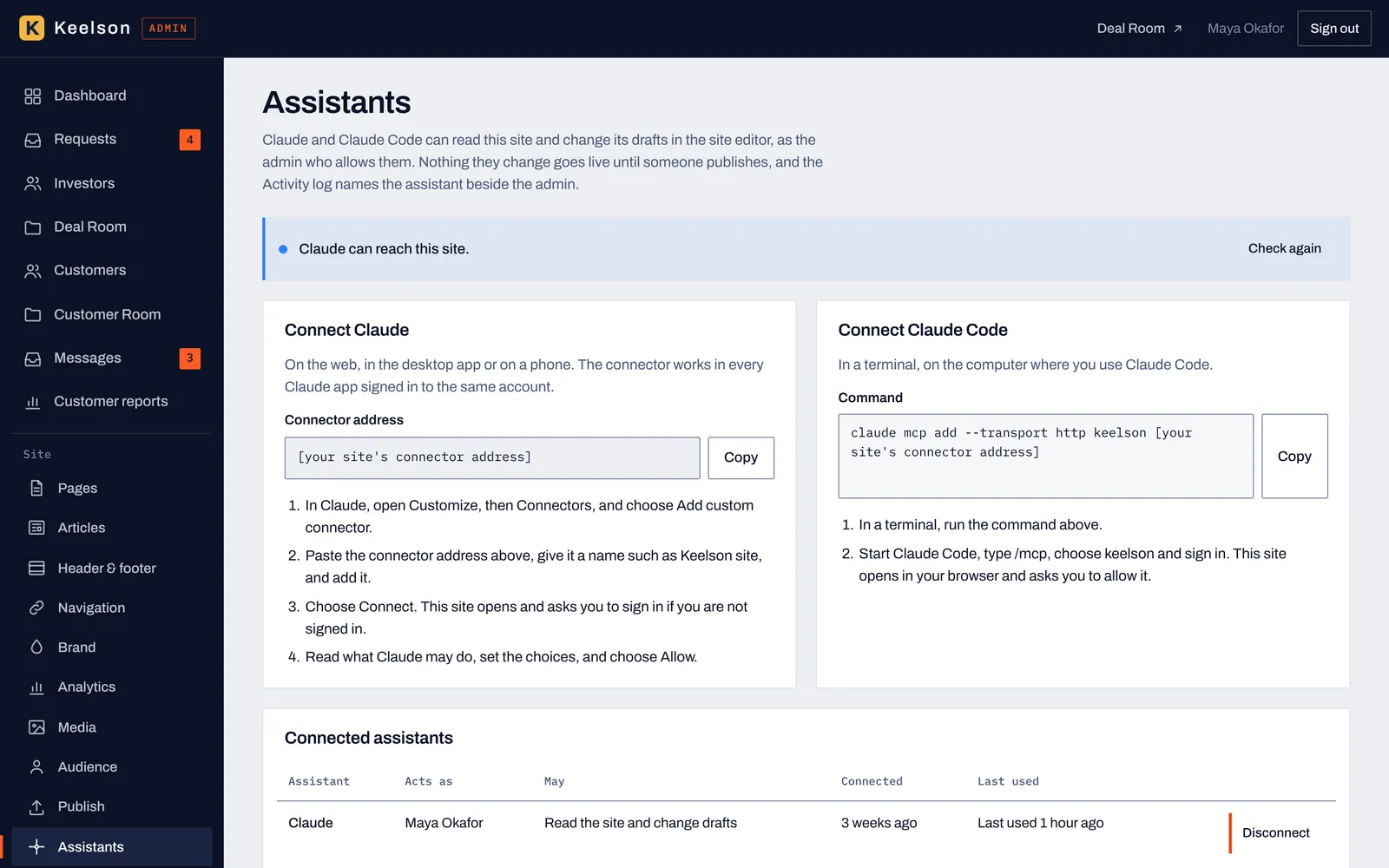
The Assistants screen walks you through each connection and lists who's connected, what each assistant may do and when it was last used.
A few of the tools your AI can call
Whatever your AI builds, you can open in the editor and change yourself. Select a block, edit its fields, move it, hide it from an audience or save it as a reusable block.
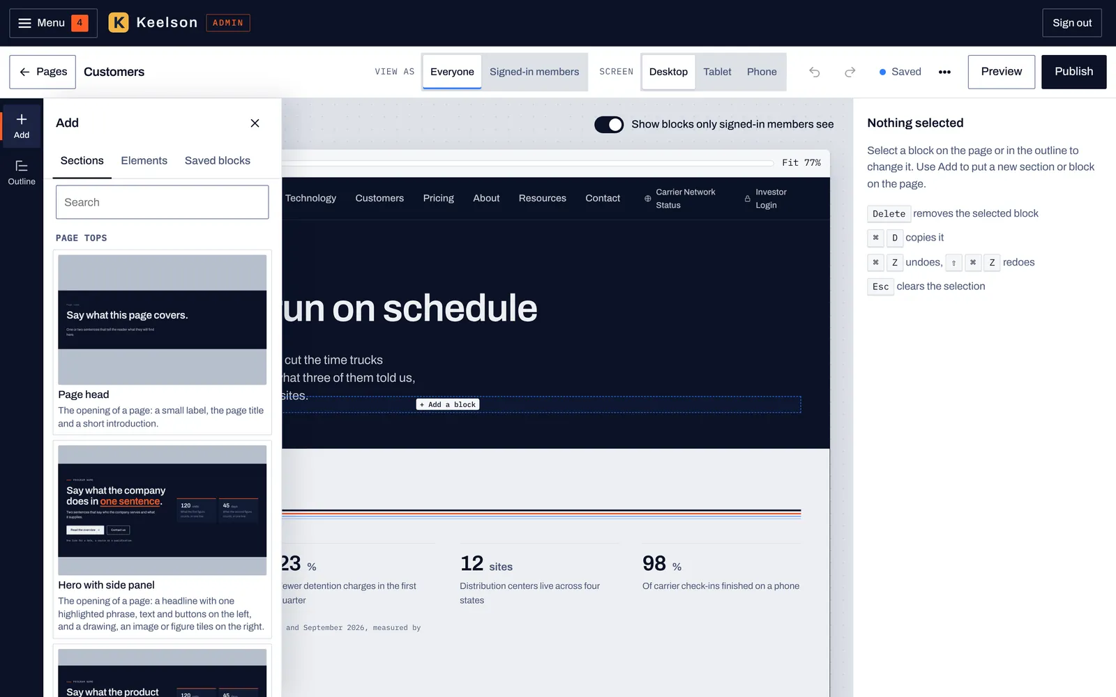
The Add panel lists the section templates in groups, each with a preview, so you can see the layout before you place it.
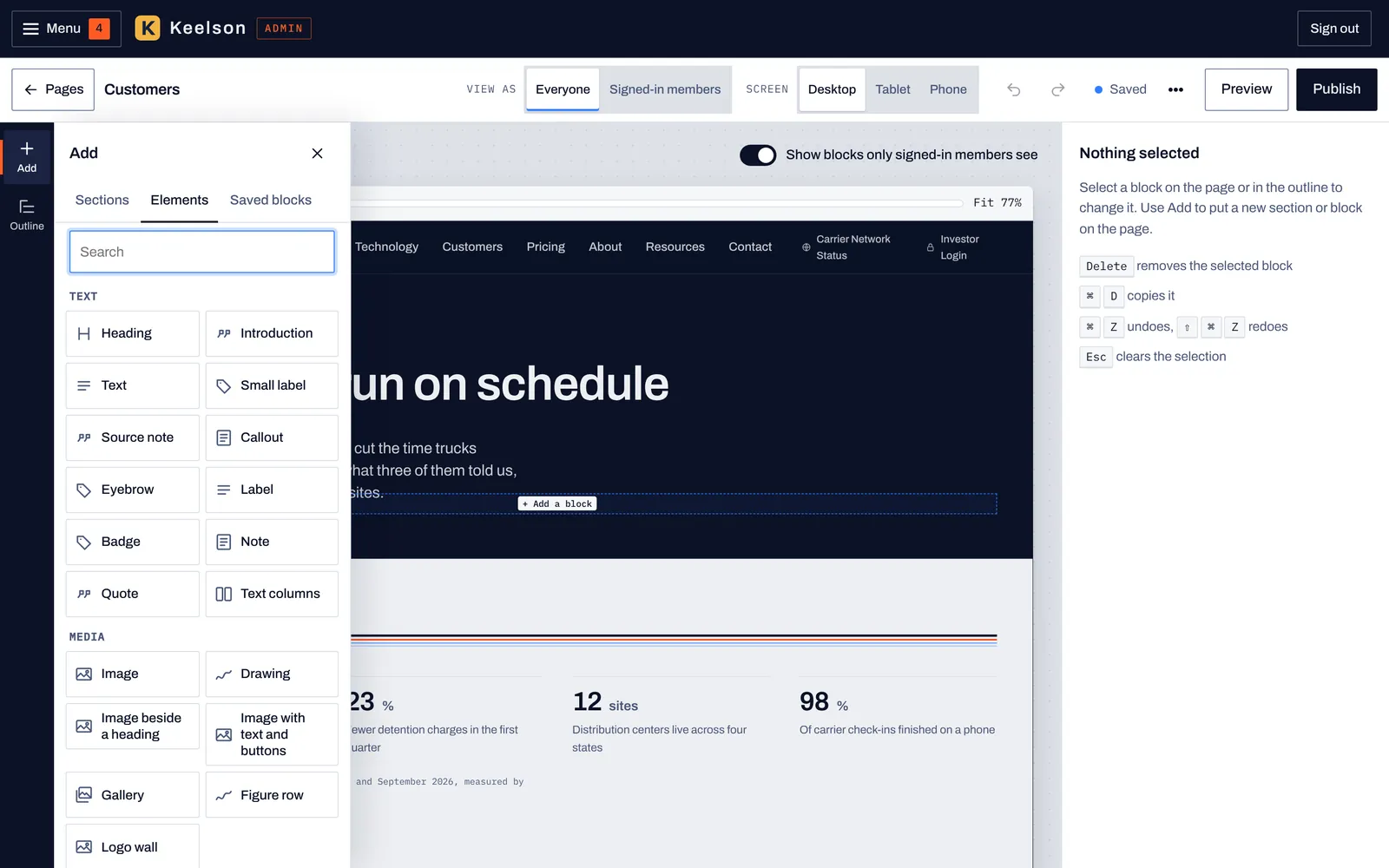
Elements are the smaller pieces, such as headings, text, images, buttons and galleries, for building a section from scratch or adding to one.
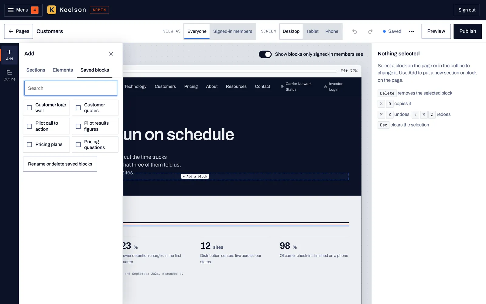
Blocks you've saved sit in their own list. Place one on another page and it arrives as a copy you can edit there.
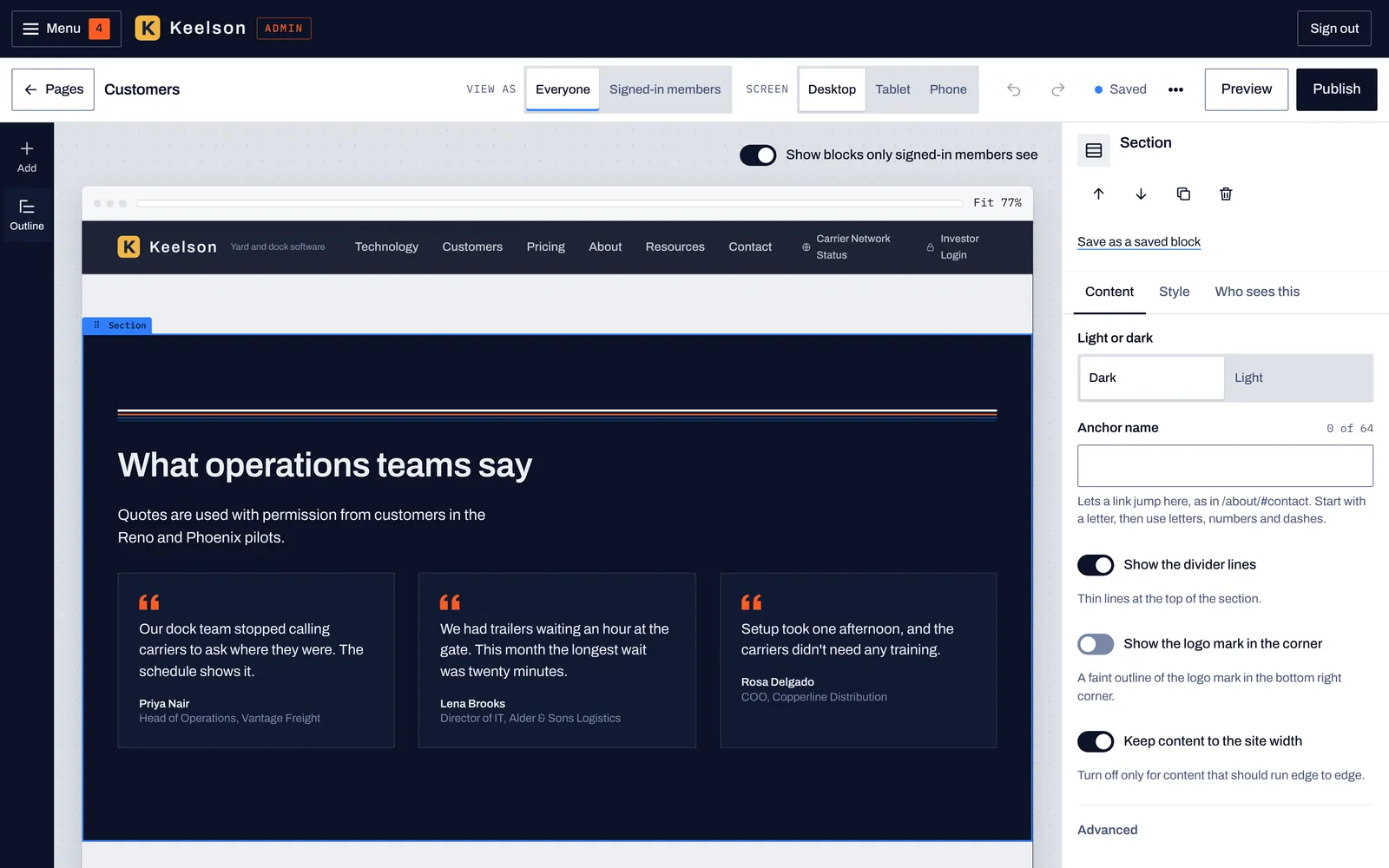
Select any block to change its content, its style or who sees it. The outline on the left lists every block on the page.
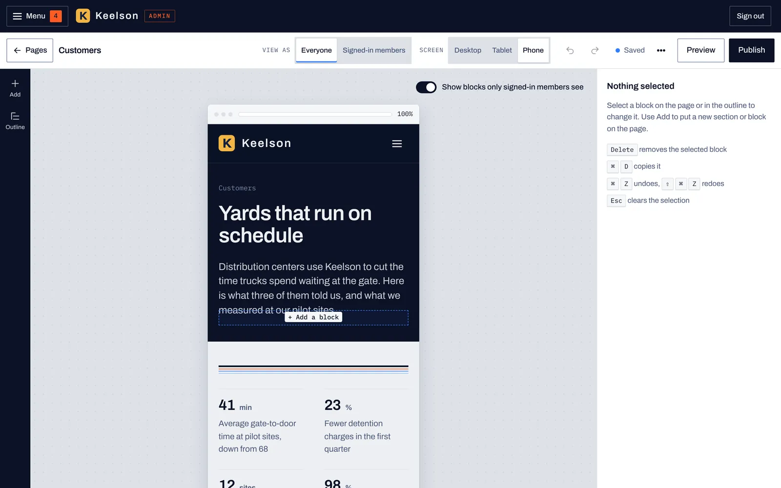
Preview the page at desktop, tablet or phone width, and as everyone or as a signed-in member, before you publish.
Founders edit between meetings, so on a tablet or phone the editor stacks the canvas above the settings and uses larger touch targets.
See the page as everyone or as a signed-in member would, at desktop, tablet or phone width.
Pages, articles, header and footer, navigation, brand and media are all in the same admin as the two rooms.
Every page is built from blocks, and the library holds the ones you'll reach for most, so you or your AI can put a page together from sections that already work and then change the words, the order and who sees each one.
A section template is a finished layout, from a hero to a pricing table to an investor call to action. Browse the groups below, and every thumbnail is the template as it looks in the Add panel.
Openings for pages and slim notices.

The opening of a page: a small label, the page title and a short introduction.
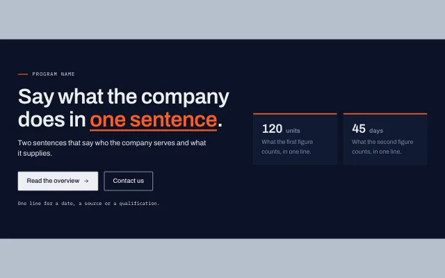
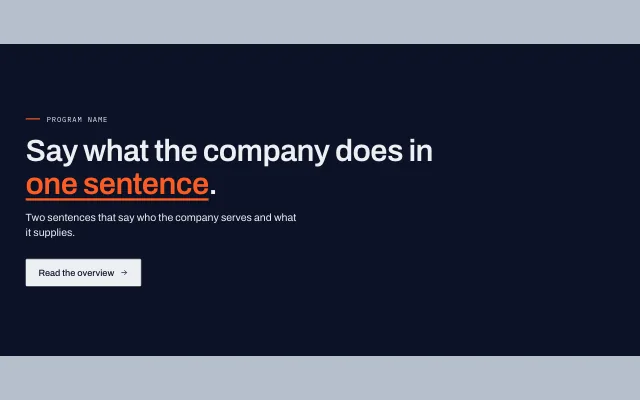
A headline with one highlighted phrase, text and buttons on the left, and a drawing, an image or figure tiles on the right.
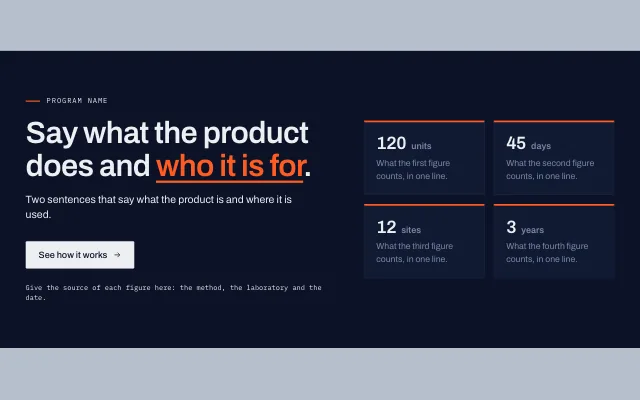
A headline, text and buttons on the left and a two by two grid of figures on the right.
A photograph behind a dark shade, with the headline, text and buttons over it.

A one line section for news or a notice, with a link. It has no close button, so it stays on the page.

A slim strip across the top of a page with one short line and one link.
Headings, columns, callouts and quotes.

A plain section with a heading and a paragraph, to build on with the blocks in the Elements list.
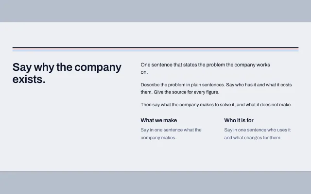
A heading on the left; on the right an introduction, two paragraphs and two short statements side by side.
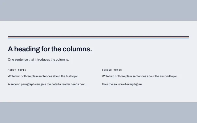
Two or three columns of text, each with a small heading. They stack on phones.

One boxed paragraph with a rule on the left, for the point a reader must not miss.
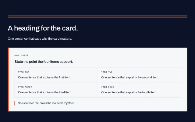
A light card with an orange edge: a heading, up to four tagged items in a grid and a closing sentence.
One quotation in large type with the name and role of the person who said it.
Three quotes side by side, each with a name and role, in boxes.
Stats, charts, tables and ledgers.
Four figures in large type, each with a short label, and a note that names the sources.

A slim section with a label, up to four figures in a row and one link.
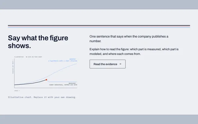
A heading and a chart that separates what is measured from what is modeled, with the explanation beside it.
Two or three figures side by side, each with a title, a drawing or an image and a caption.
Four large figures with a caption and a source line each, counting up when they scroll into view.
Horizontal bars with the value on each bar and an outline for an estimate.
Dots on one axis scaled by powers of ten, for values that differ by orders of magnitude.
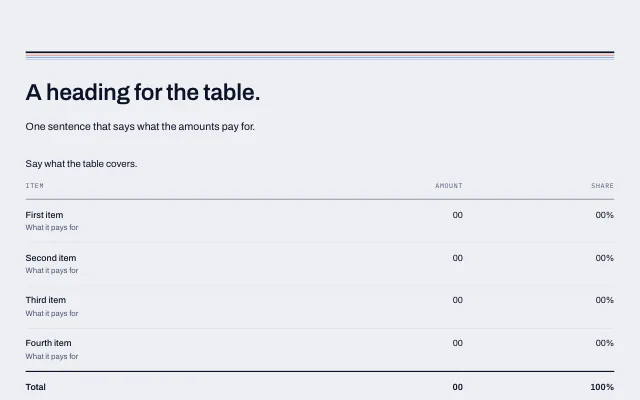
A table of rows with a label, an amount and a share, an optional total and a details list that opens and closes.
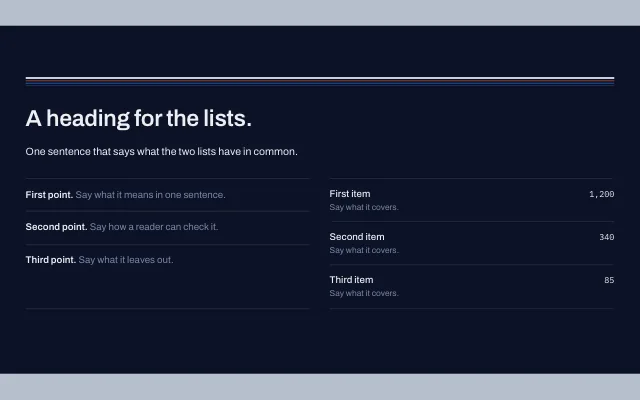
Two lists side by side: points with a bold lead, and labels with their values.
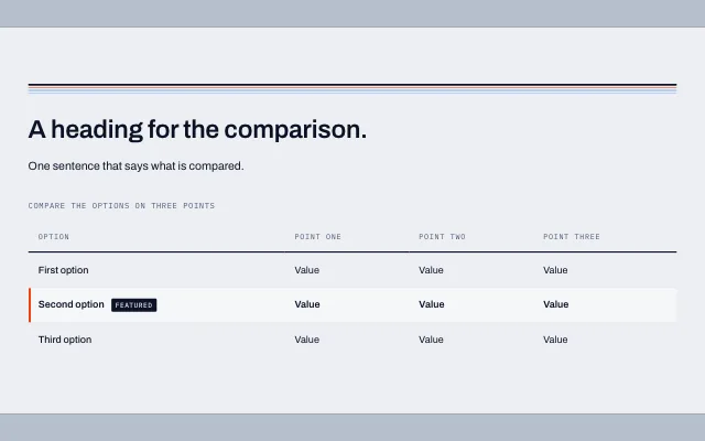
A table that compares options across a few points, with one row that can be highlighted. On phones each row becomes a stack that keeps its column names.
Cards, principles, team, notes and article lists.
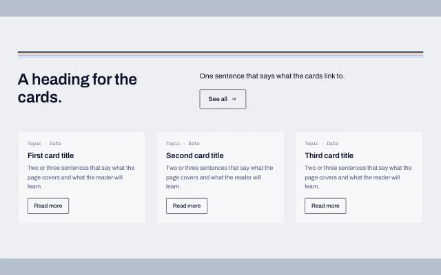
A heading and introduction above three cards, each with a label, a title, a summary and a link.
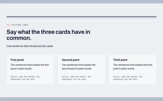
A heading and introduction above three cards, each with a title, a short text and a line naming its source.
A heading and a sentence above the site's articles as cards. The list's settings choose the layout and which articles it shows.
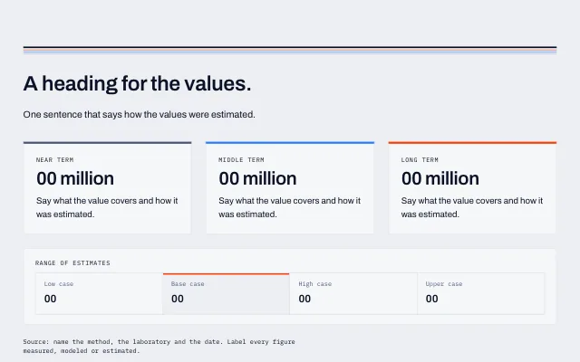
Two or three cards that each state a value, with a bar underneath that compares up to four cases.
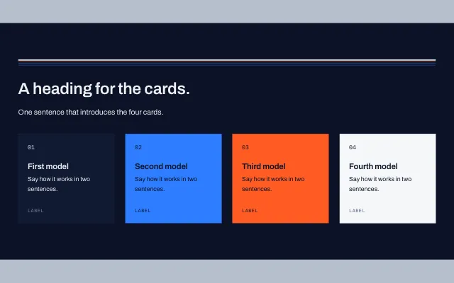
Two to four cards with a solid fill, each with a number, a heading, a short text and a tag.
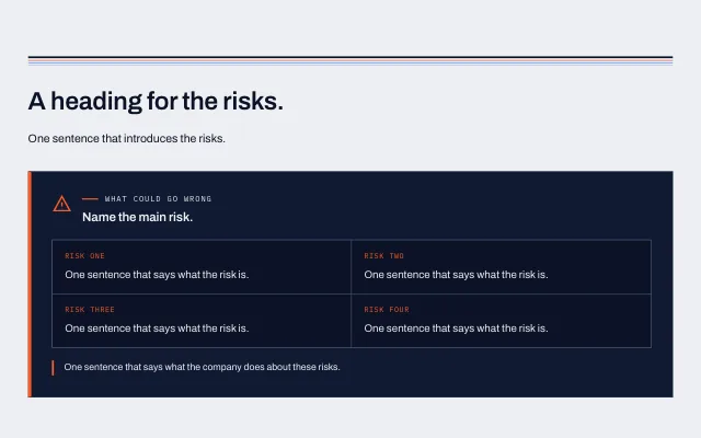
A dark card with a mark, a heading, up to four tagged items and a closing sentence.
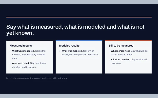
Three columns that sort claims into measured, modeled and not yet measured.
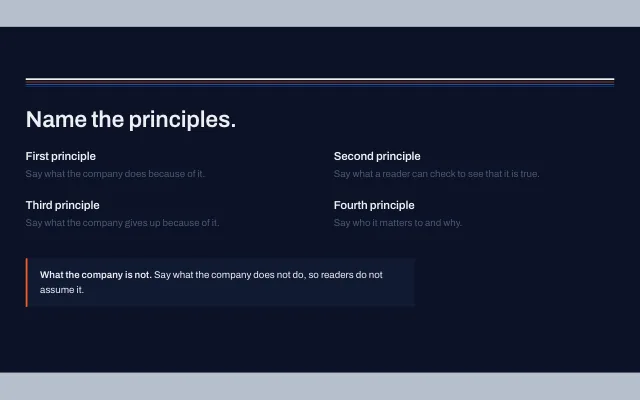
A heading, four short principles in two columns and a boxed note on what the company is not.
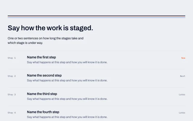
A heading and introduction above four numbered rows, each with a title, text and a status on the right.
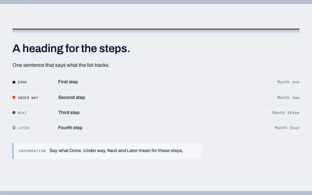
A list of steps, each with a state, and a note that says what the states mean.
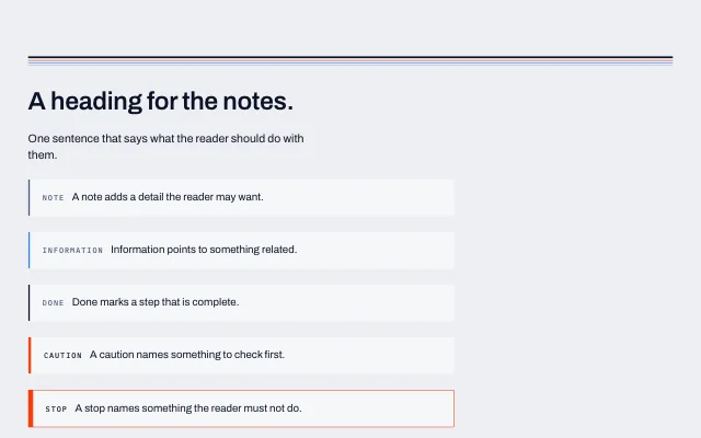
Five kinds of short note: a note, information, a completed step, a caution and a stop.
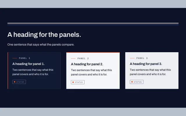
Three cards in a row, each with a label, a heading, text and a badge, in dark, light and solid surfaces.
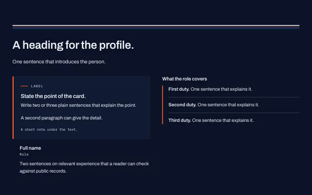
A card with a heading and text, a person under it, and a ruled list beside them.
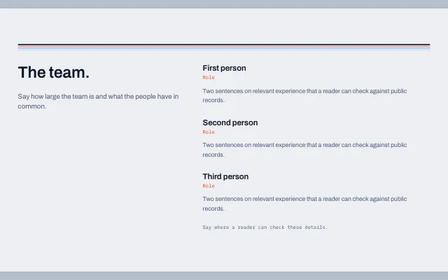
A heading and a short introduction beside three people, each with a role and a biography.
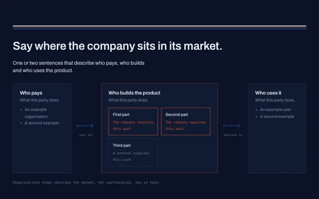
Three cells joined by labeled arrows that show where the company sits between its customers and the people who use the product.
Timelines, processes, milestones and pricing.
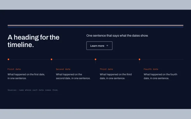
A heading and introduction above four dated events on a line, with a note for the sources.
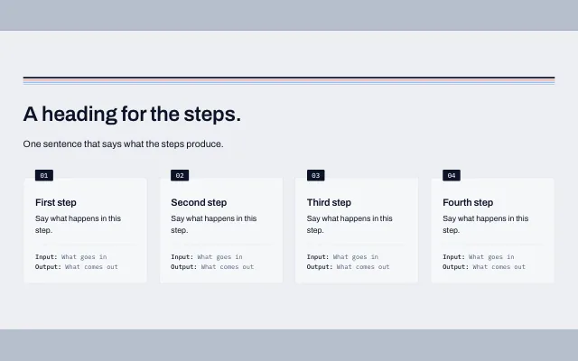
Numbered steps in a row, each with a title, a short text and a line saying what goes in and what comes out.
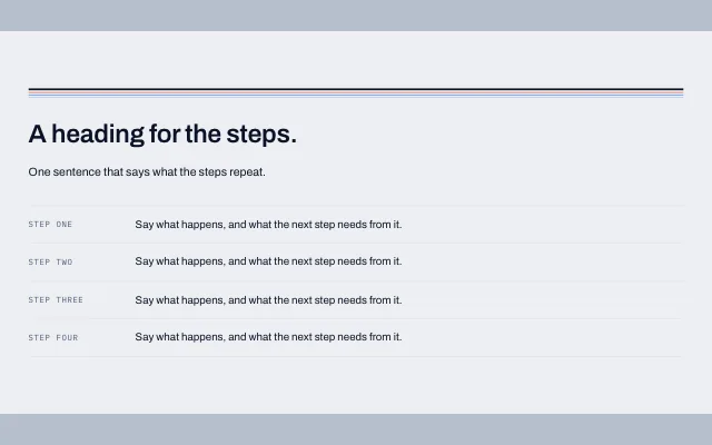
An ordered list where each step has a short label in a column on the left.
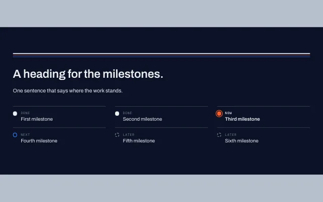
A list of milestones, each marked done, now, next or later, with a status word.
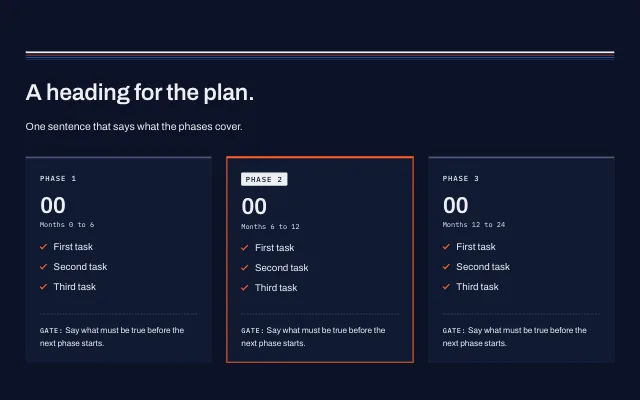
Two to four plan columns, each with a label, a headline figure, a short list and a closing gate. One can be highlighted.
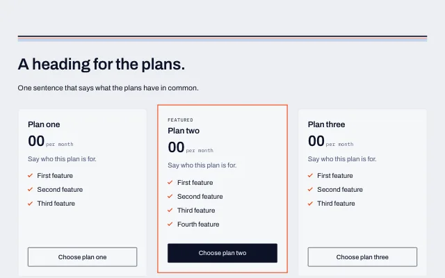
Two to four plans side by side, each with a name, a price, a list of features and a button. One can be highlighted.
Answers that open, tabs and flip panels.
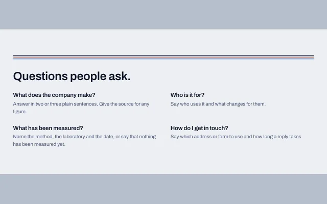
A heading and four questions with their answers. The page also lists them for search engines.
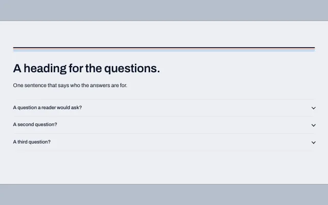
Questions or sections that open and close, with an option to keep one open at a time.
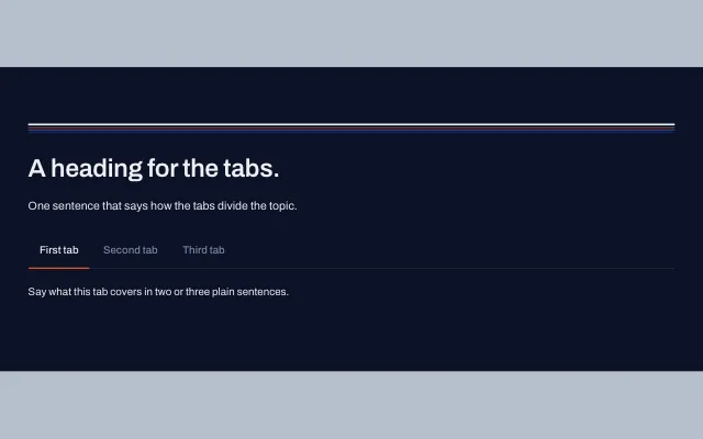
Two to six tabs, each with its own text.
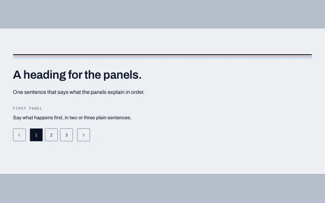
Text panels shown one at a time, with previous and next buttons and numbered tabs.
Pictures with text, galleries and logo walls.
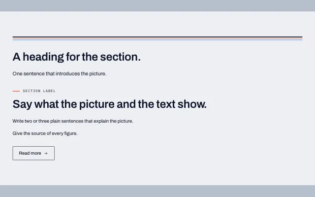
An image on one side and a heading, text and buttons on the other. They stack on phones.
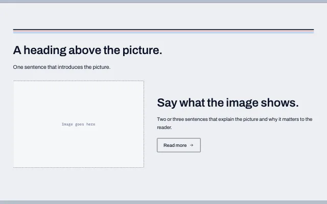
One image beside a heading, a paragraph and a button.
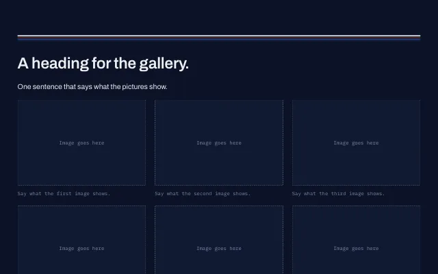
A grid of images with captions. Each image can link to its full-size file.
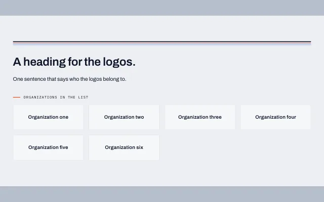
Up to eight logos in a grid. Each sits on a light tile, so dark logos read on a dark section. They can be shown in gray.
Page endings, contact forms and investor access.
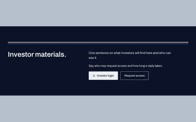
A dark section for investor materials, with a sign-in button and a button to request access.
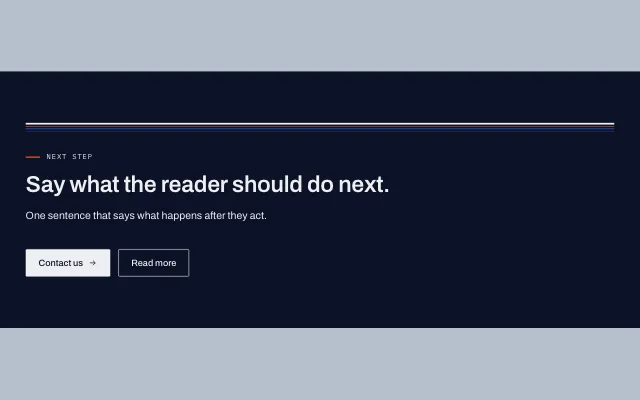
A section that closes a page: a heading, one sentence and one to three buttons.
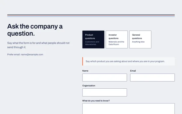
A heading and a short note on the left and the contact form on the right. A page can hold one contact form.
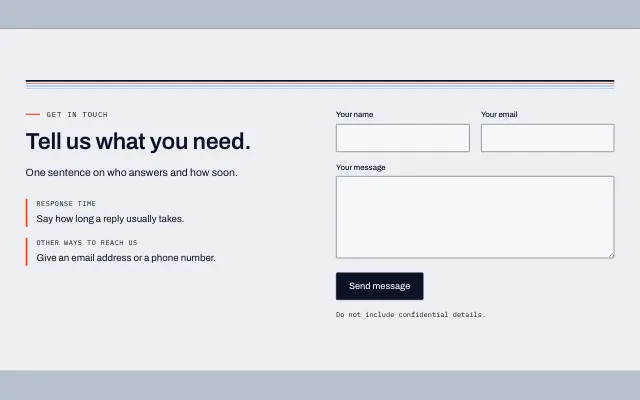
A section with a heading and short notes on one side and a form on the other.
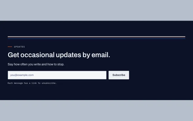
A section with a heading and a one field form that collects an email address.
Small labels, badges and dividers.
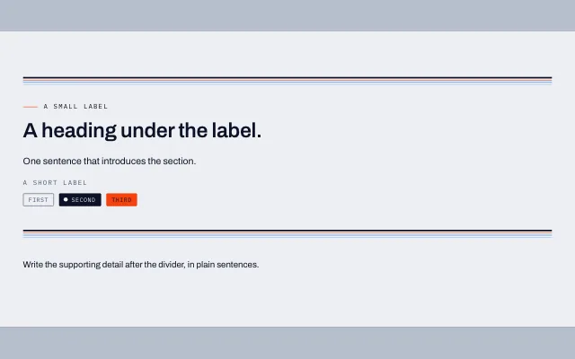
Small labels above and below a heading, badges, and a divider between two blocks of text.
Three complete pages to begin from, each made of the section templates above.
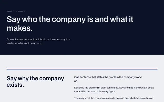
A page head, why the company exists, its principles and its team.
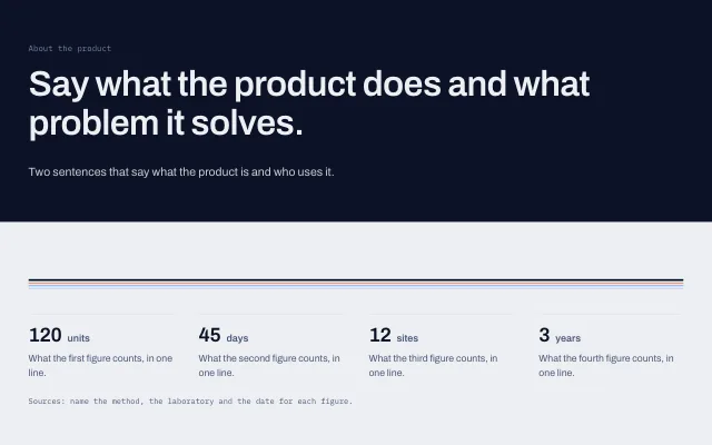
A page head, four figures, the stages of the work and common questions.
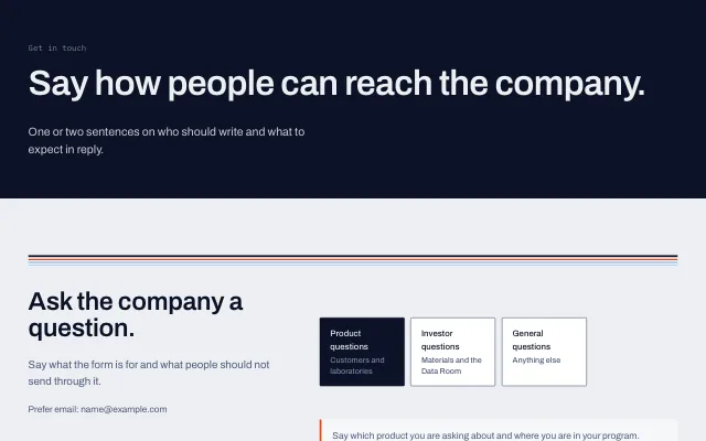
A page head, the inquiry form, common questions and a callout.
Four ways to lay out a blog post or news item, chosen per article.
Elements are the pieces inside a section. Place them one at a time to build a section from scratch, or add one to a template that's almost right.
Headings, paragraphs, labels, quotes and notes.
Images, drawings, galleries and logo walls.
One button, a row of buttons and the contact form.
Columns, grids, stacks, panels, spacing, lines and dividers.
Figures, cards, principles, team, timelines and other repeating groups.
Callout, risk and value cards, pricing columns, and step or phase layouts.
Single figures, bar and log scale charts, comparison tables and ledgers.
Accordions, tabs and flip panels.
The pieces that go inside lists.
For the rare case that needs it.
Things you use on many pages are kept once and shared, so a change to the brand or the menu reaches every page.
Save any block you've built and place it on other pages. Each placement is a copy, so editing one page doesn't change the others.
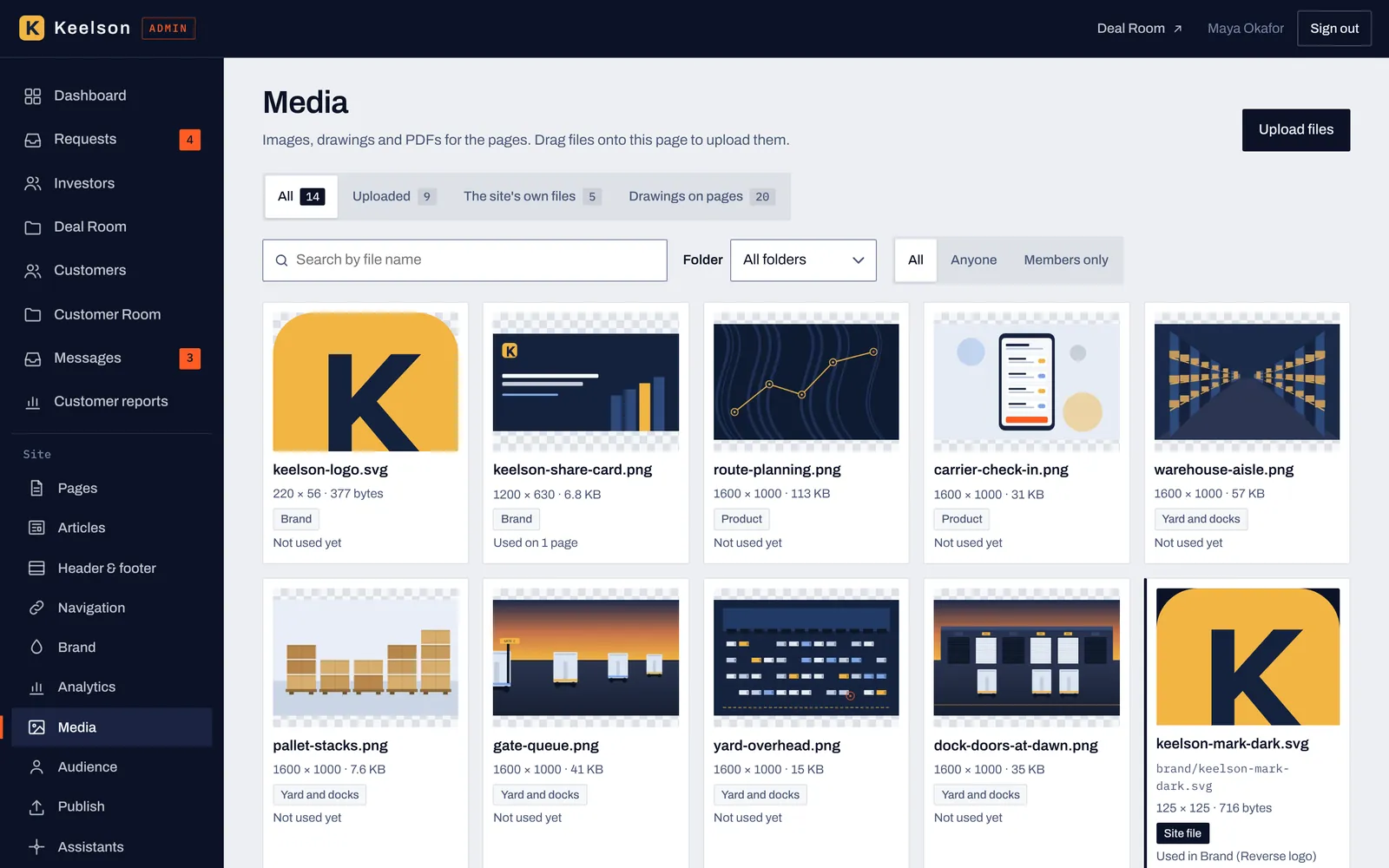
Upload images, drawings and PDFs once, see where each is used, and mark a file for anyone or for members only.
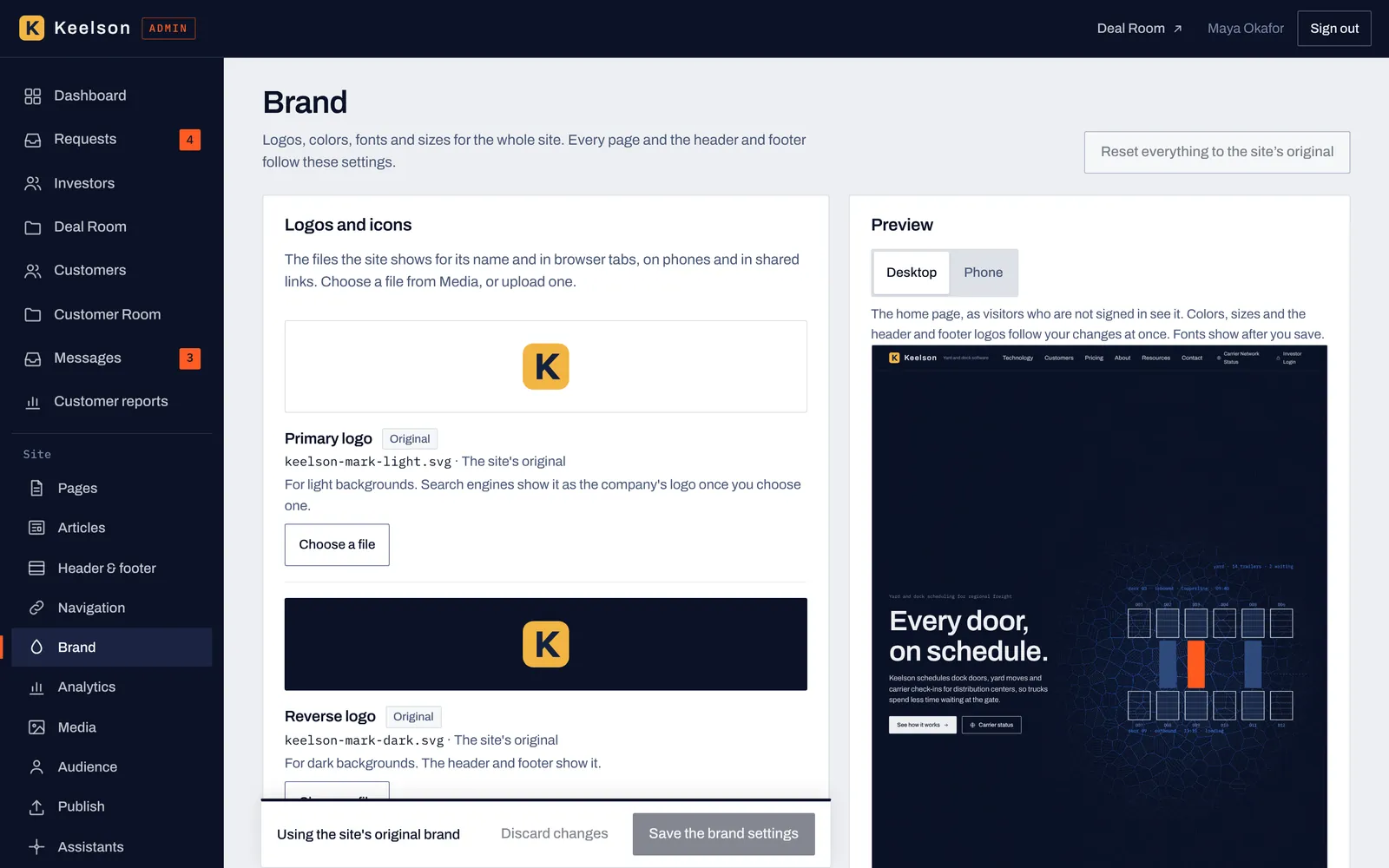
Logos, colors, fonts and sizes are set once, and every page, the header and the footer follow them, with a preview before you save.
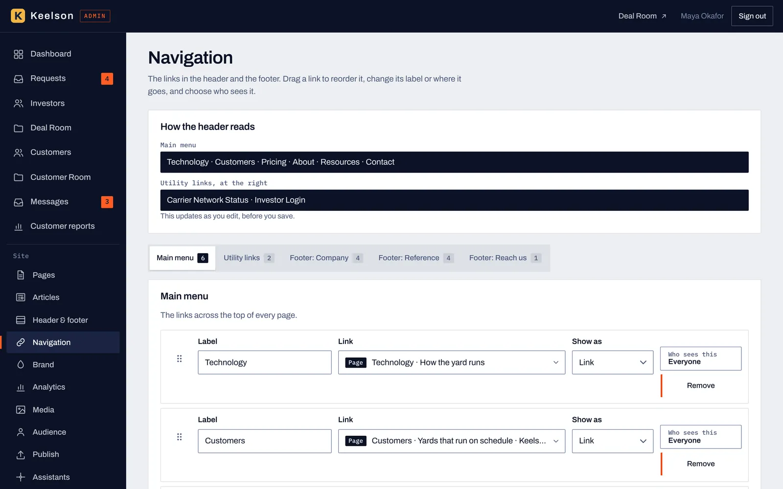
The main menu, the utility links and the footer lists are managed in one place. Drag a link to reorder it, and choose who sees it.
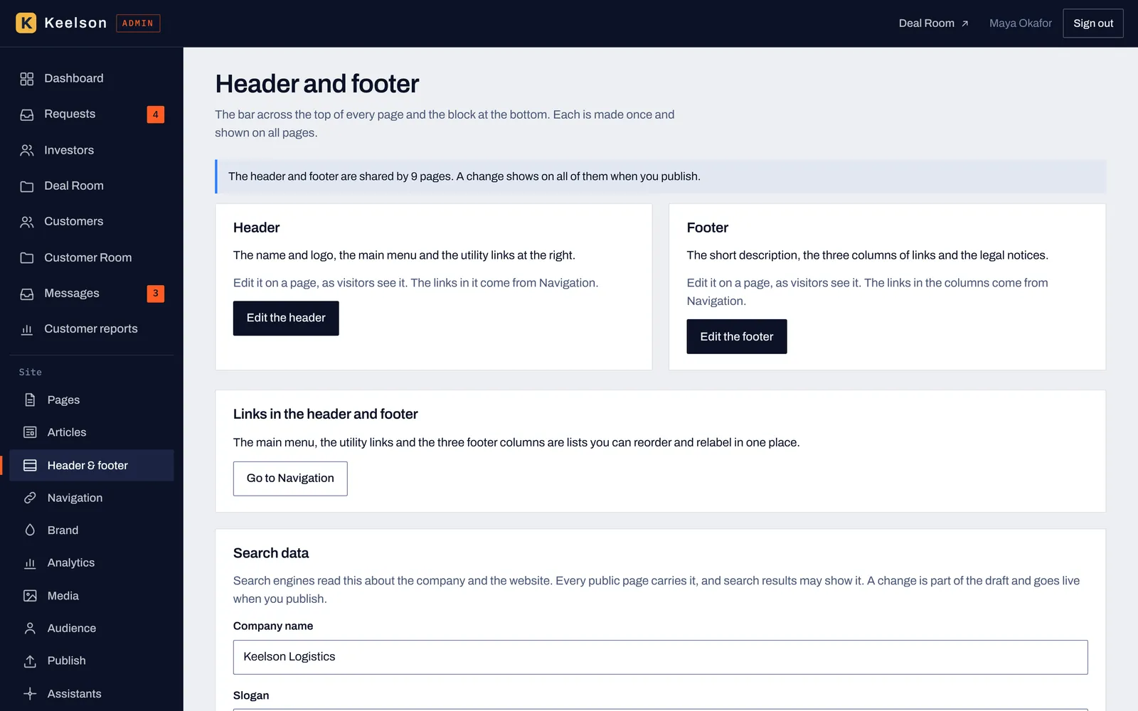
The header and footer are made once and shown on every page, and the Search data card holds the company details search engines read.
Every block on a page can be shown to everyone, to people who aren't signed in, to signed-in members or to groups you set up, such as customers or investors. Preview the page as each audience before you publish, from the editor or from a link your AI gives you.
Account pricing, onboarding and support content for signed-in customers, on the same address as the public page.
Traction figures, the round and the use of funds for approved investors, with a path into the Deal Room.
Access is decided on the server, and the content of a gated block is never part of the page the public receives.
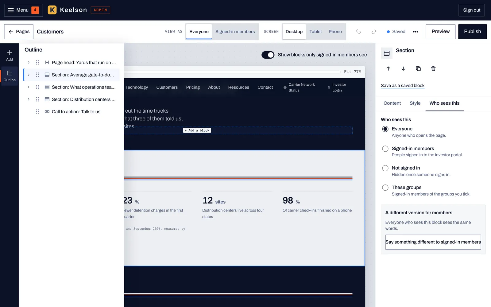
The Who sees this tab sets one block for everyone, for signed-in members, for people who aren't signed in or for chosen groups, and it can hold a different version for members.
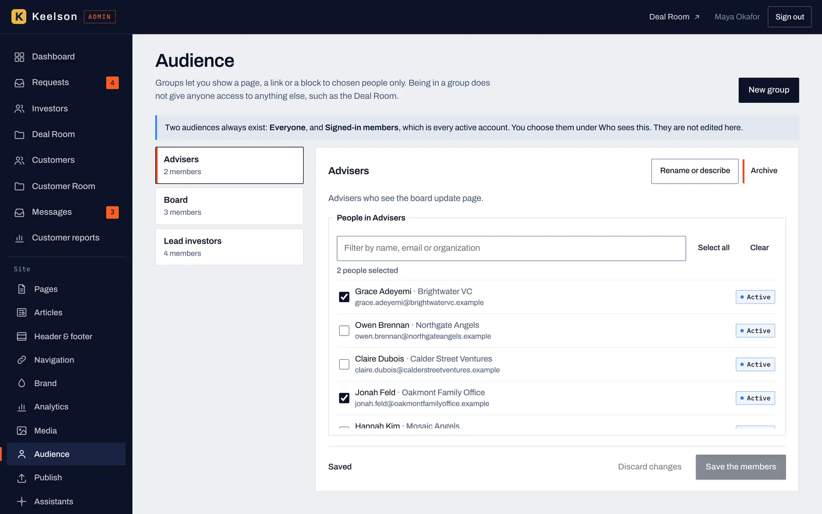
Groups such as advisers, board members or lead investors are built from the people who have accounts. Being in a group doesn't open the Deal Room or anything else on its own.
Investors ask for access from your site, you approve them, and they open a room of folders and documents in the order you set. You see who read what, for how long, and who hasn't opened anything lately.
Admin · what you manage
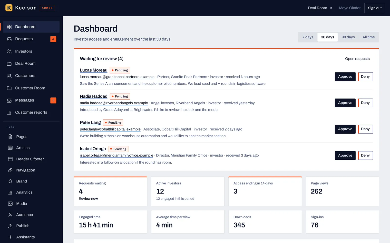
Requests waiting for review sit at the top with Approve and Deny, above the totals for views, reading time, downloads and sign-ins over 7 days, 30 days, 90 days or all time.
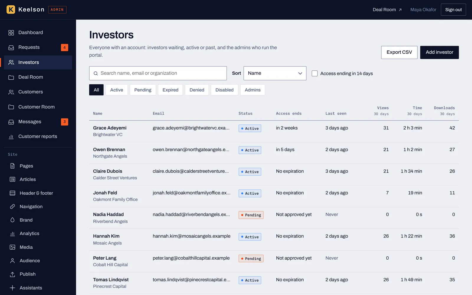
Everyone with an account in one list, with status, access end date, last seen and 30-day engagement, a search box, filters and a CSV export.
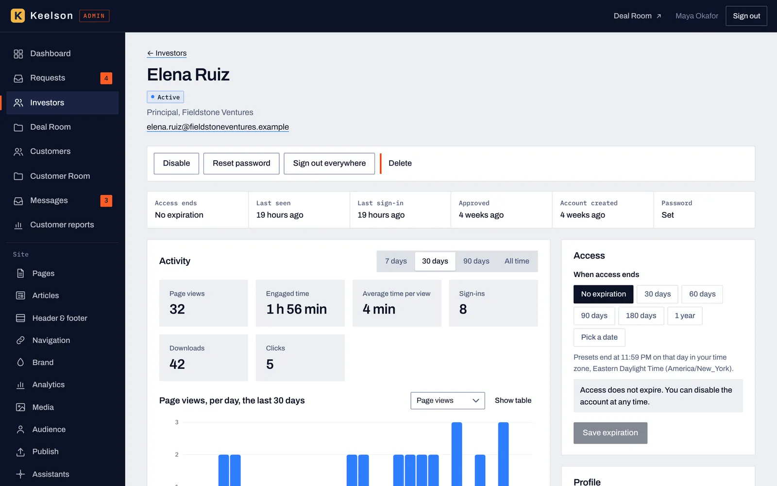
Each investor has a page with their activity, a chart of page views per day and controls to disable the account, reset a password or sign them out everywhere.
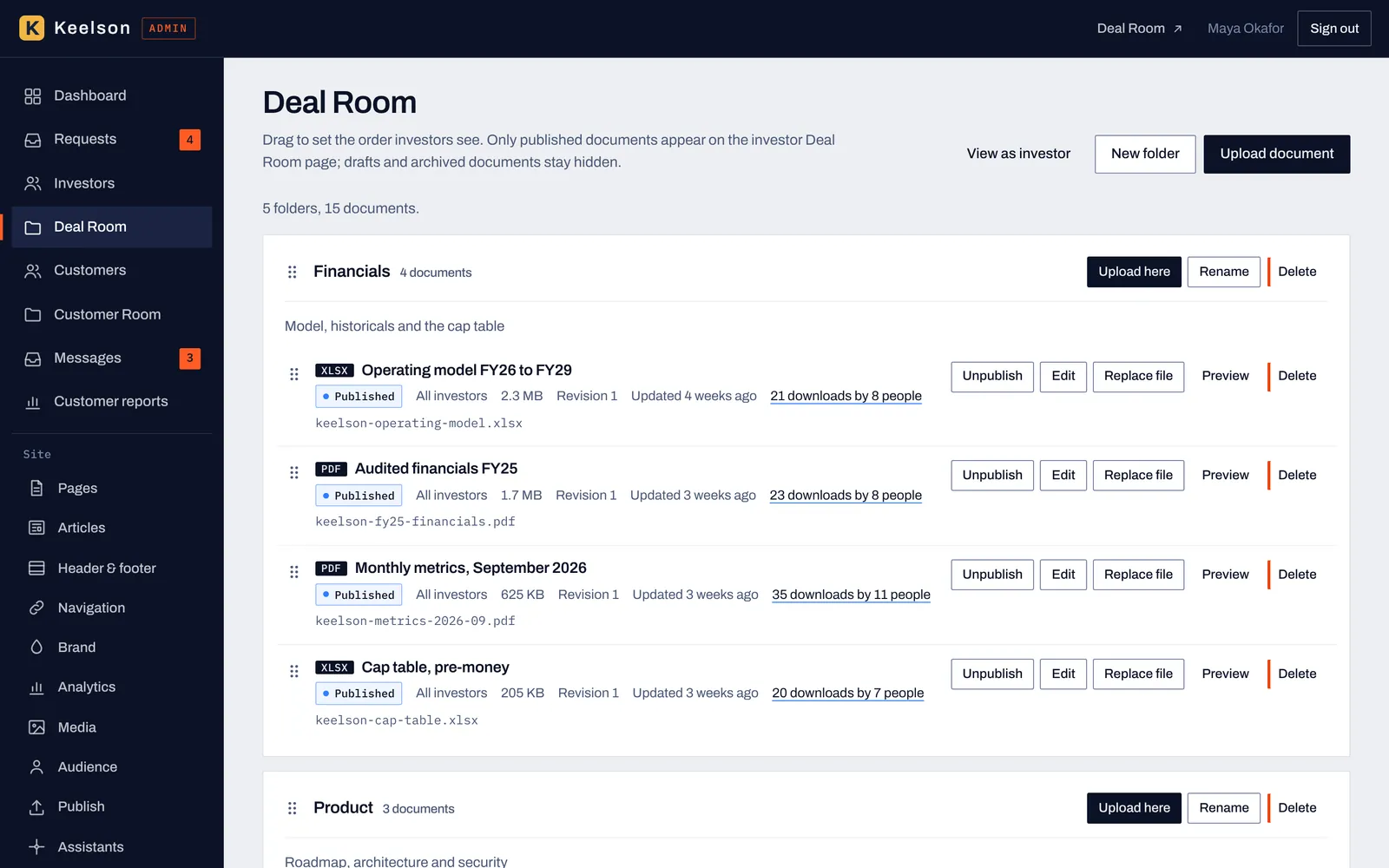
Folders and documents in the order investors read them, with revision numbers, who downloaded each file and buttons to replace, unpublish, preview or delete.
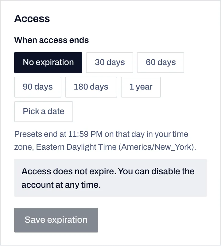
Set an end date for each investor from a preset or a calendar date, and the dashboard lists who is expiring in the next 14 days.
Investor view · what they see
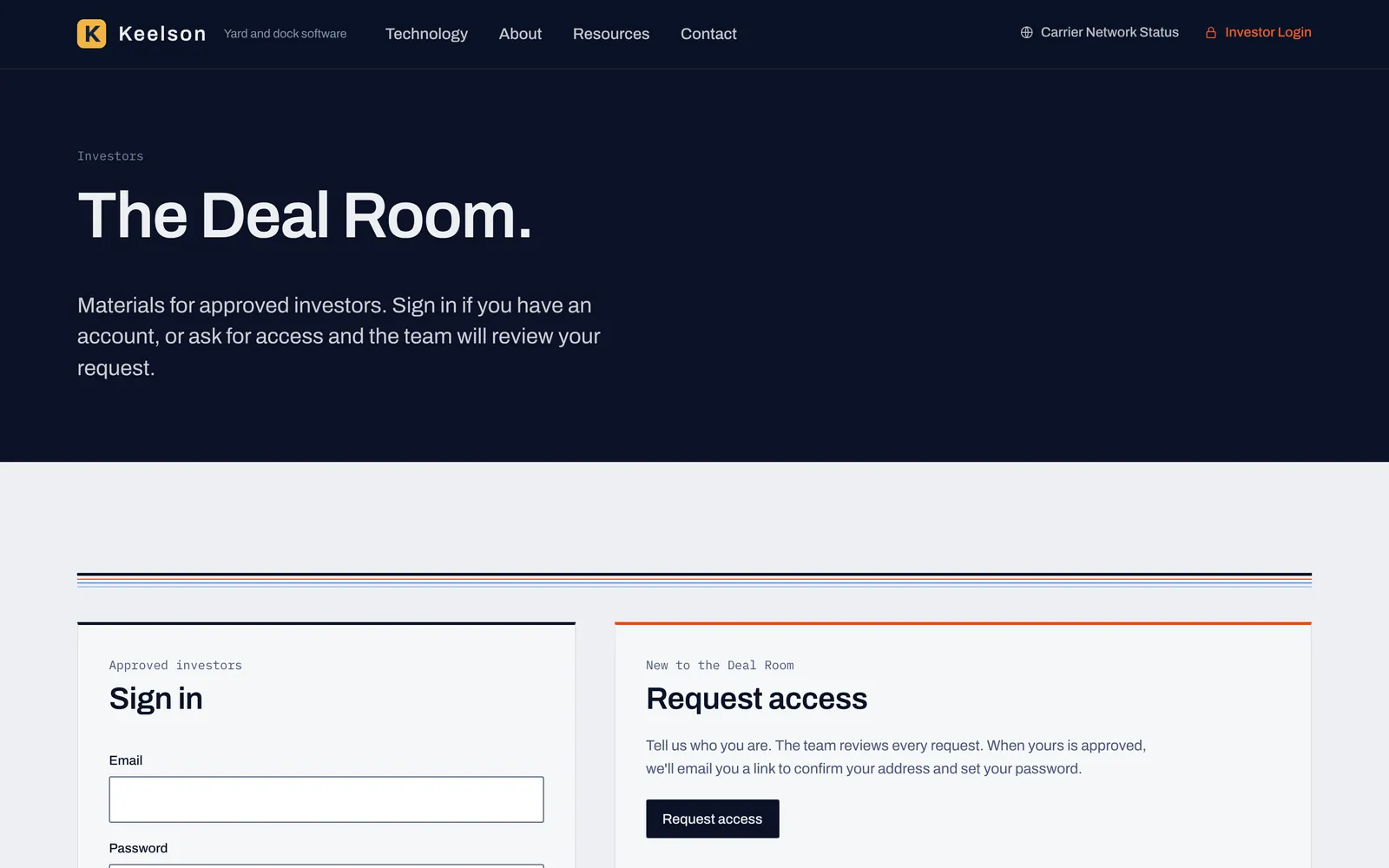
An investor who isn't approved yet lands on a page with a sign-in form and a request form, under your brand.
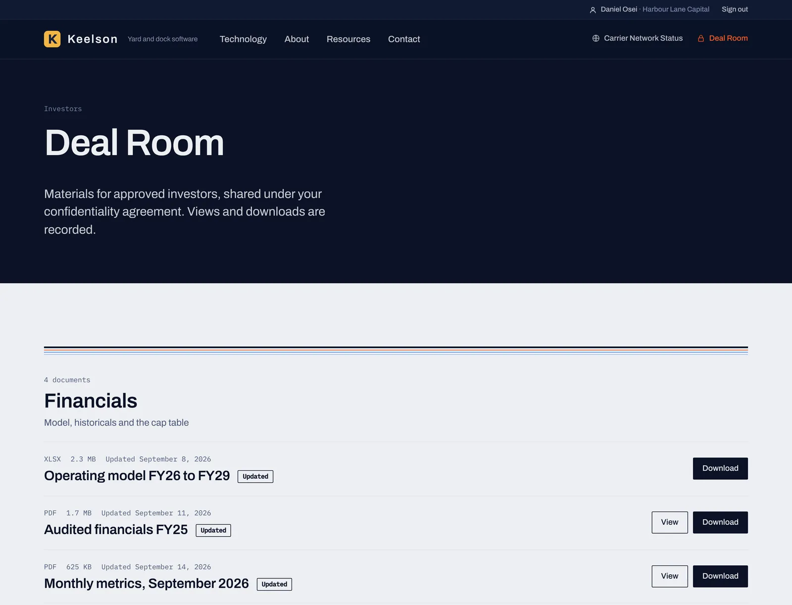
Approved investors see your folders, each file's type and size, labels for new and updated files, and a Download button.
The Deal Room controls who can open your documents and records what they do. It doesn't verify that an investor is accredited, it isn't a funding portal, and no website can stop someone from photographing their own screen.
Each organization you work with gets its own documents, a message thread with your team, its invoices and a place to upload files, all on your site and under your brand. The screens below are from a phone, which is where many customers will open it.
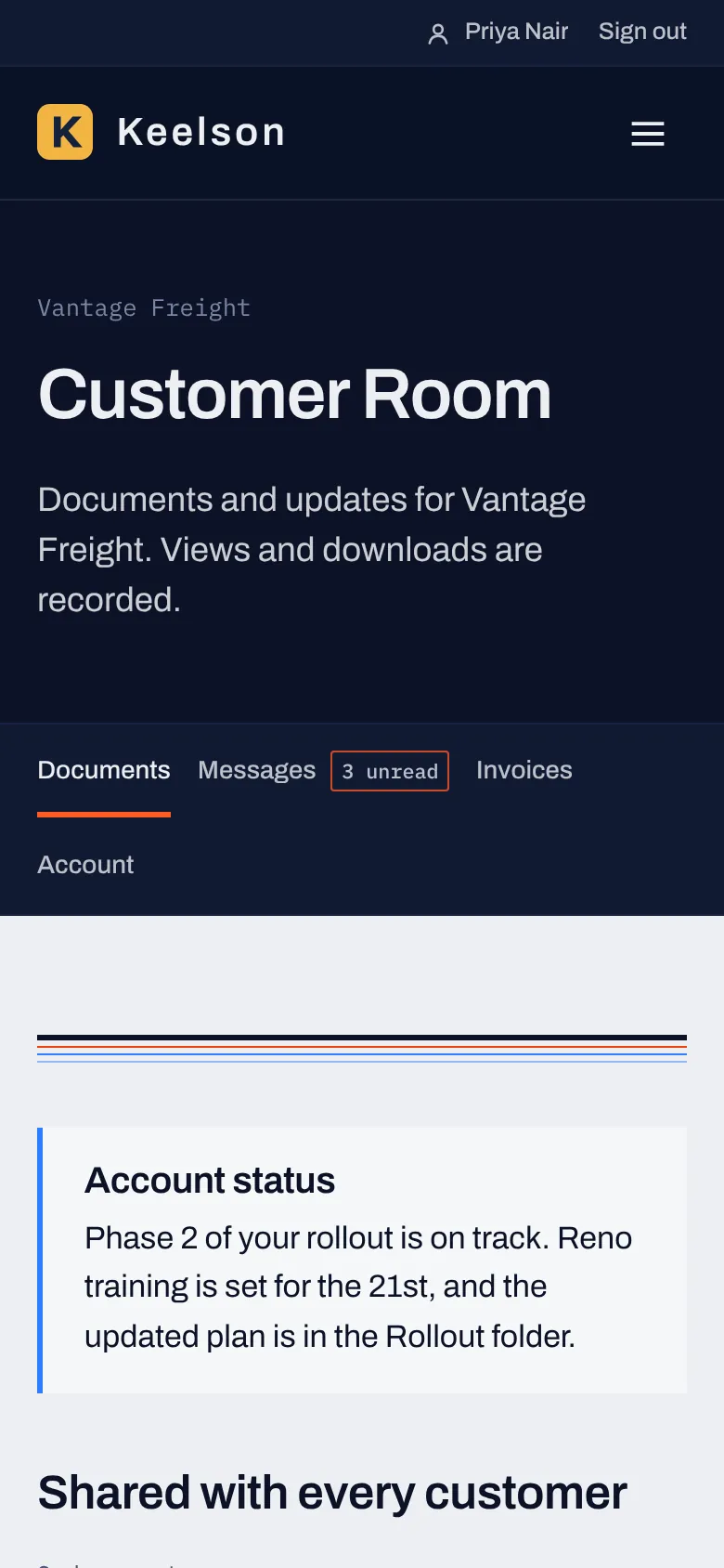
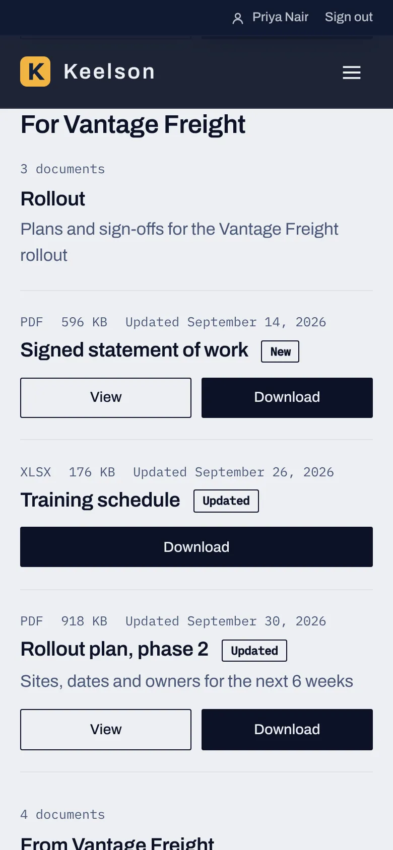
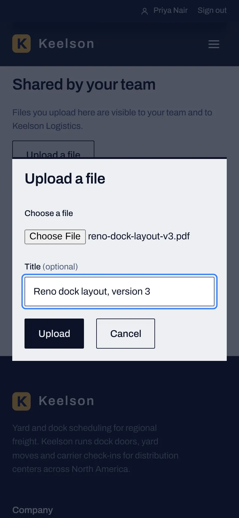
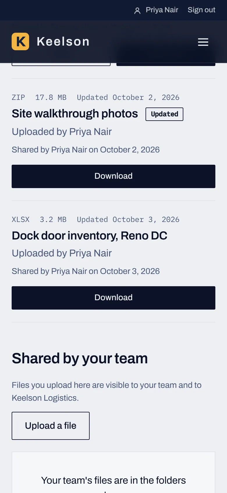
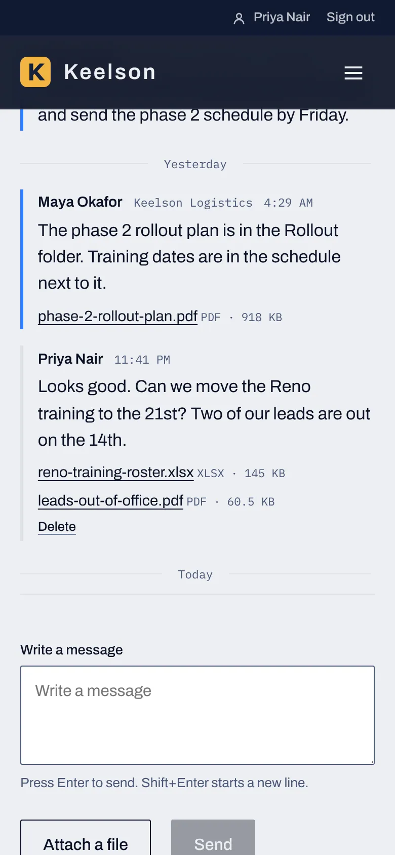
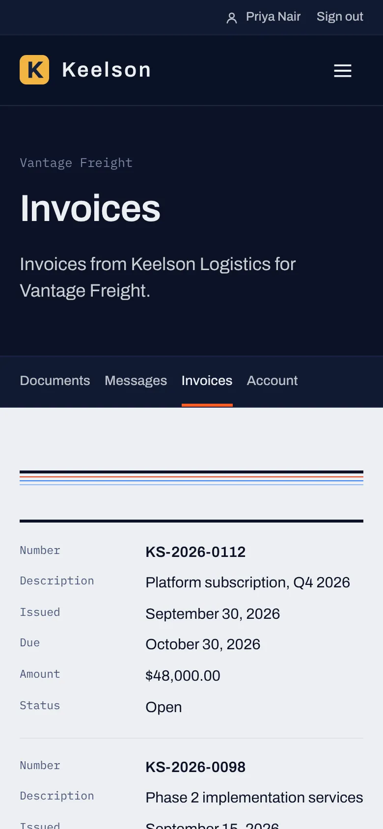
Both rooms live on your site under your brand, and each is made for a different reader.
| Deal Room | Customer Room | |
|---|---|---|
| Who it's for | Investors and advisers you approve | Customer organizations and the people on their accounts |
| Getting in | Each room can be off, private or open. When the Deal Room is open, anyone can ask for access and you approve each request. | When the Customer Room is private, only invited accounts can sign in. There's no request form, and nothing on the site announces it. |
| What people open | Folders of documents in the order you set, with labels for new and updated files | Documents shared with every customer, documents shared with one account, messages and invoices |
| What people can do | Read and download the documents you publish | Read and download documents, upload files up to 20MB each, message your team and view invoices |
| What you see | Views, reading time, downloads and sign-ins by investor and by document, and the requests waiting for you | Active accounts, sign-ins, page views, downloads, uploads and the conversations waiting for a reply |
| Admin screens | Dashboard, Requests, Investors and Deal Room files | Customers, Customer Room documents, Messages and Customer reports |
Every page has the fields search engines and AI assistants look at, VectorCanvas builds the structured data from what you've already entered, and the publish checklist tells you what's still missing. No tool can promise a ranking or a citation, so the aim is to give each page the clearest signals you control.
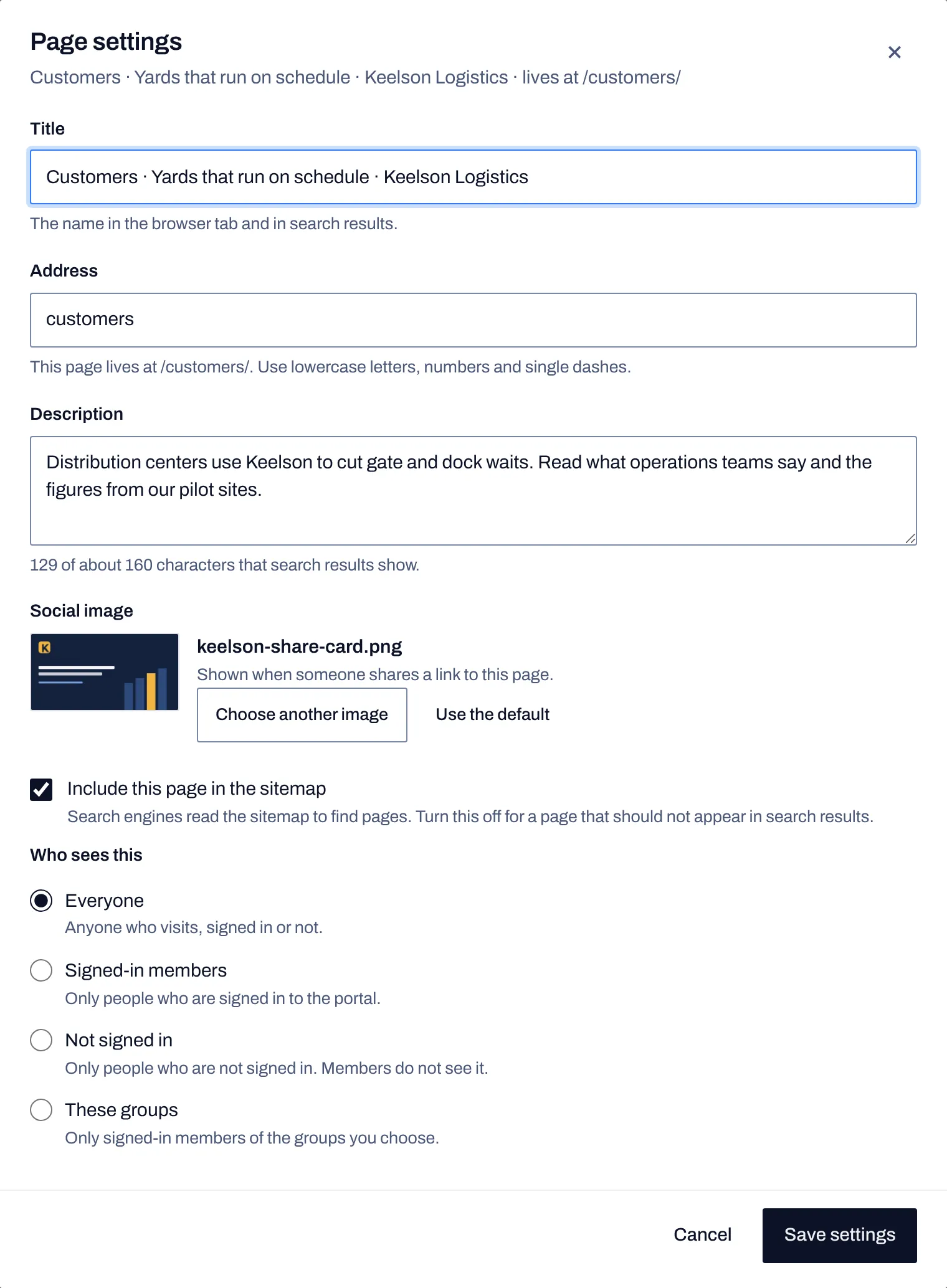
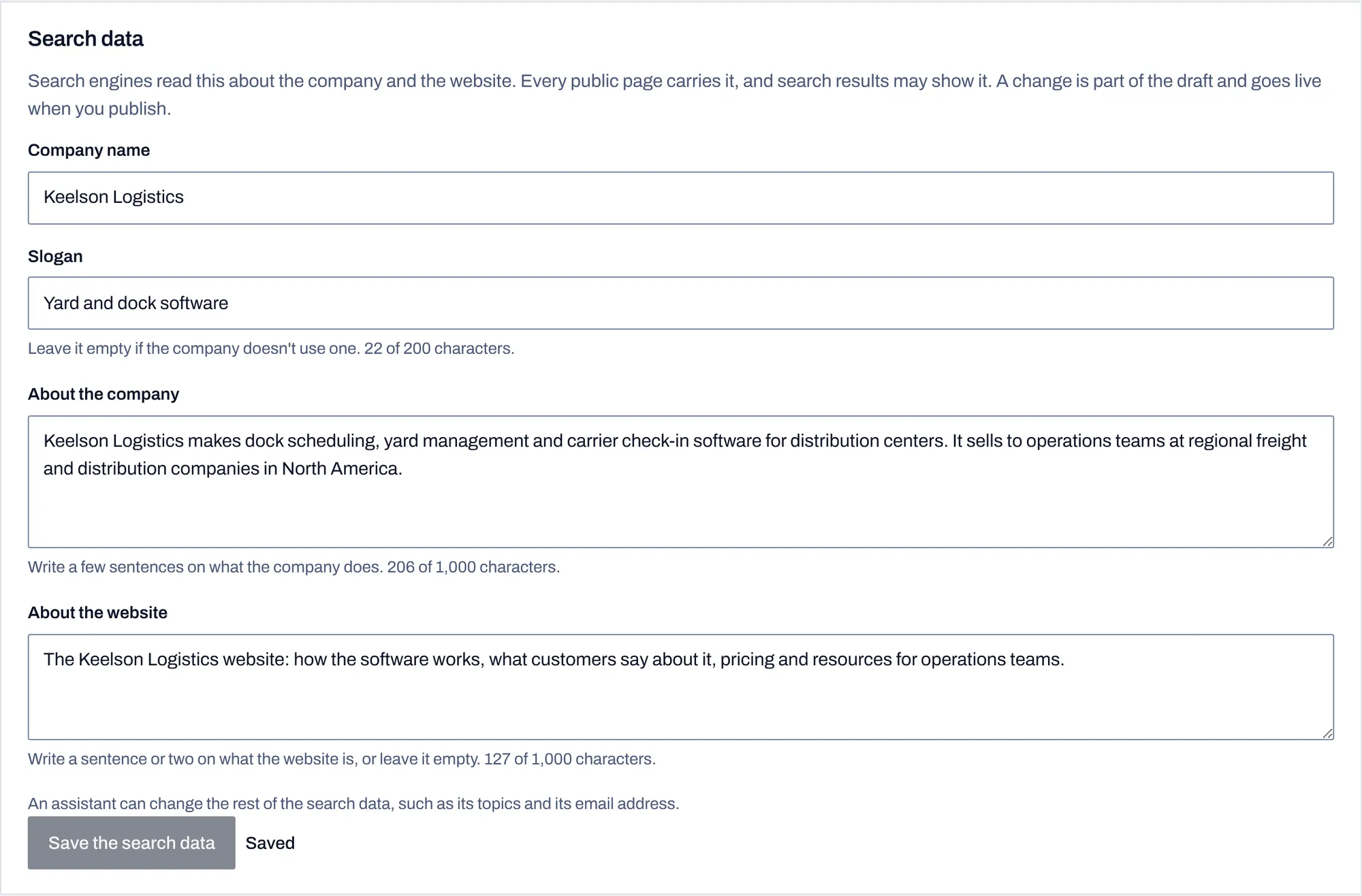
The Search data card is filled in once and feeds the organization and website data on every page, which is also the information search engines may show about you.
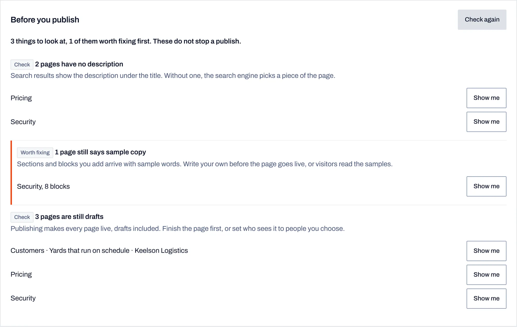
Before you publish, the checklist lists pages with no description, blocks that still hold sample copy and pages that are still drafts, with a button to jump to each one.
Every change, whether you made it or your AI did, is saved as a draft. Publishing is a separate step, and the activity log keeps a line for each change with the name of the person and the assistant they used.
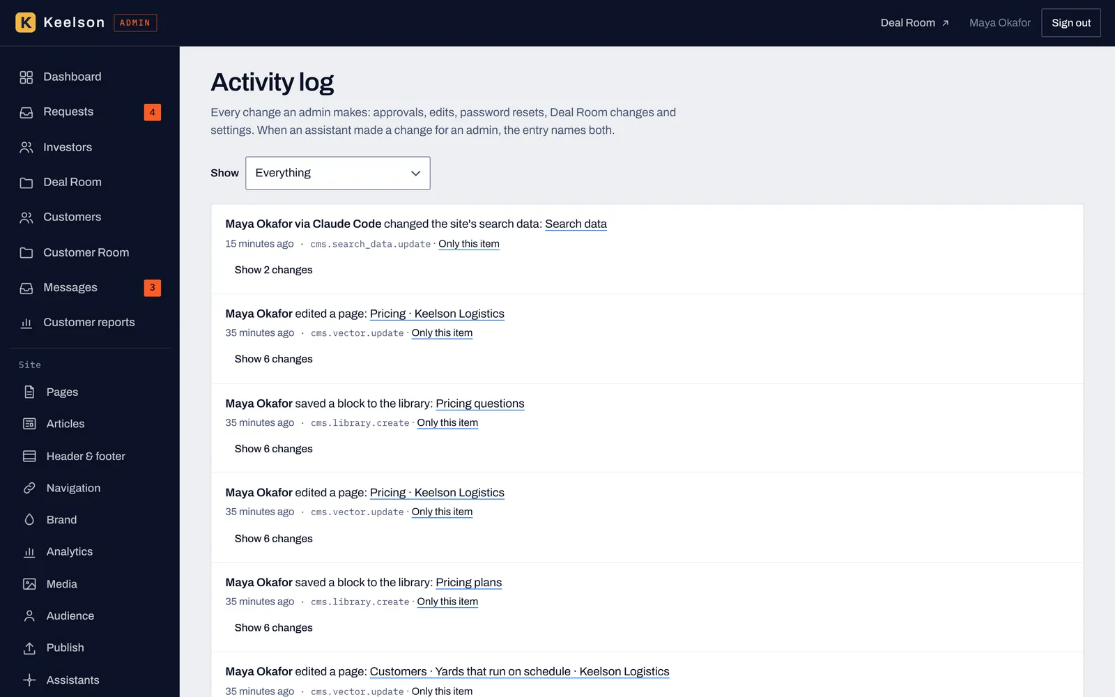
Every approval, edit and setting change is listed, and when an assistant made the change the entry names the assistant next to the person who connected it.
Connect an assistant in a few steps, see what it may do and when it was last used, and disconnect it whenever you want.
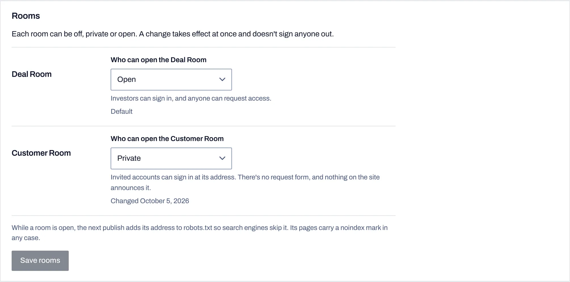
Set each room to off, private or open. A change takes effect at once and doesn't sign anyone out.
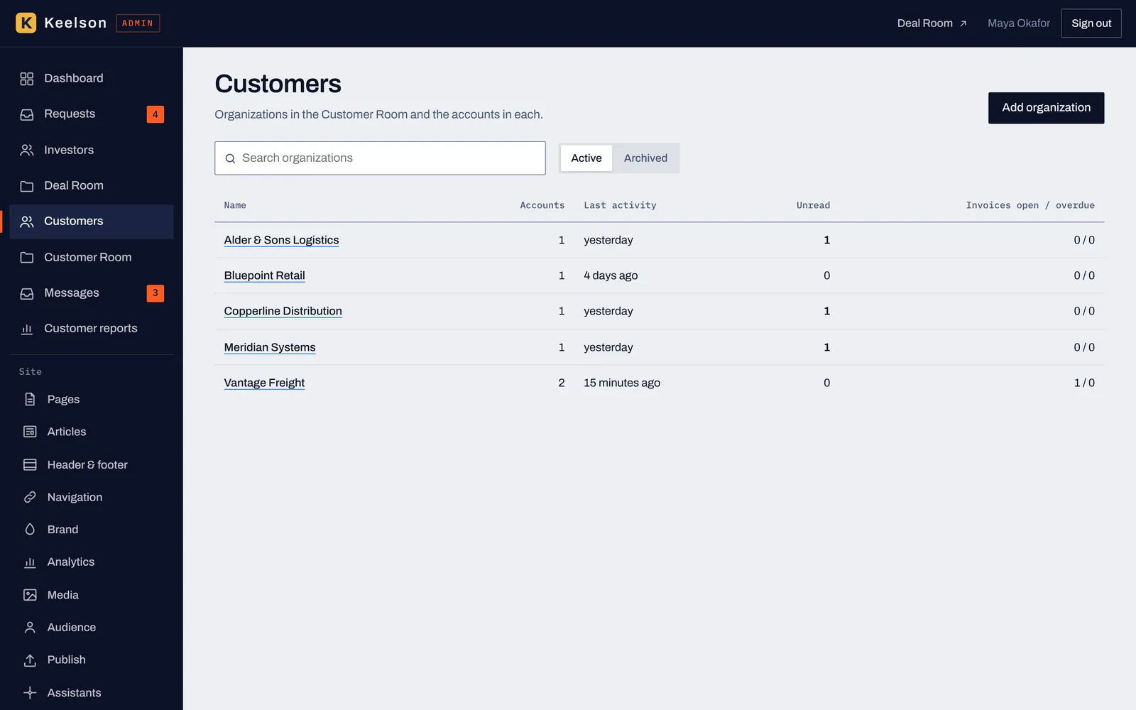
Customer organizations with the number of accounts, last activity, unread messages and open or overdue invoices.
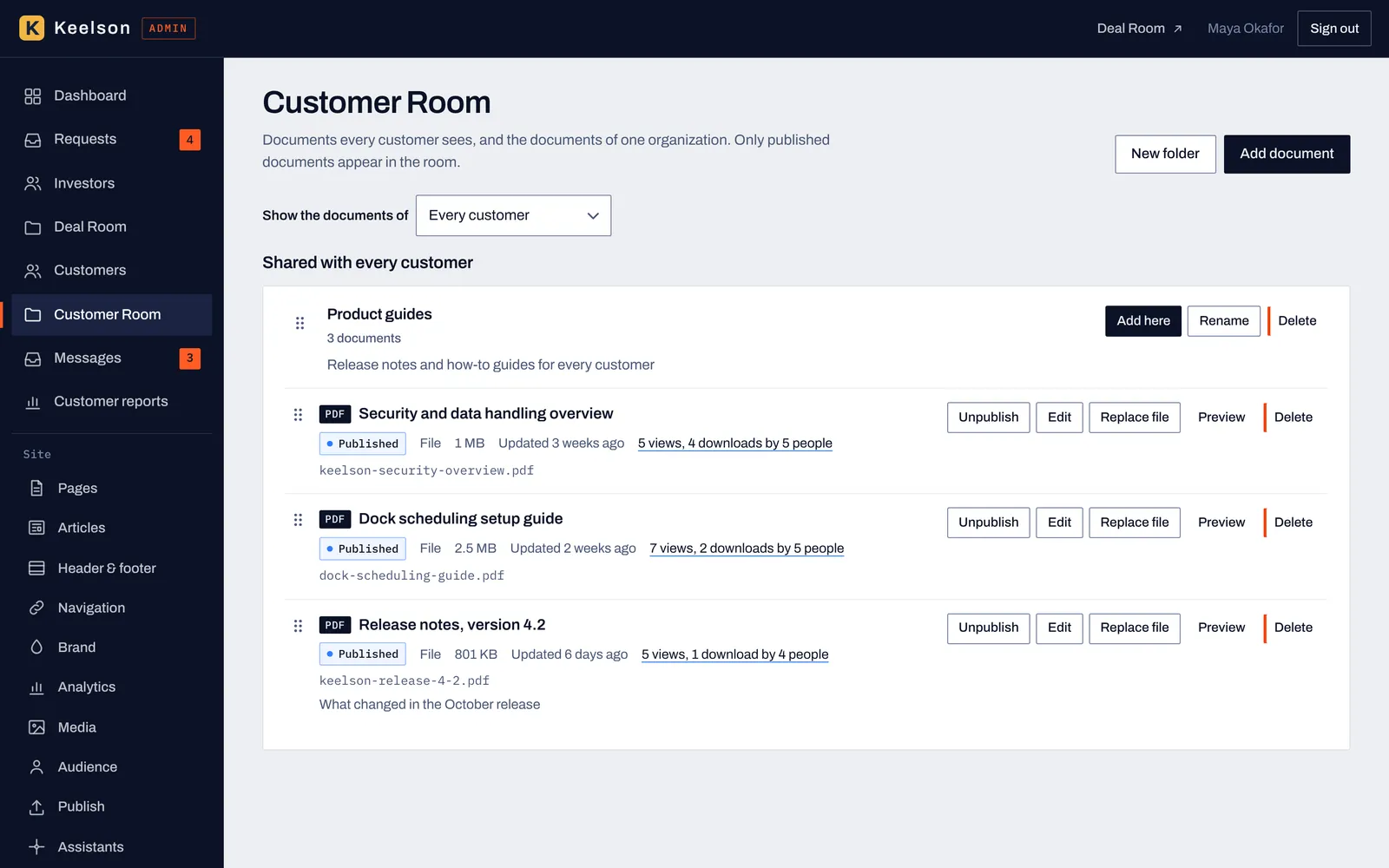
Choose whether you're looking at the documents every customer sees or one organization's, with publish state, views and downloads for each file.
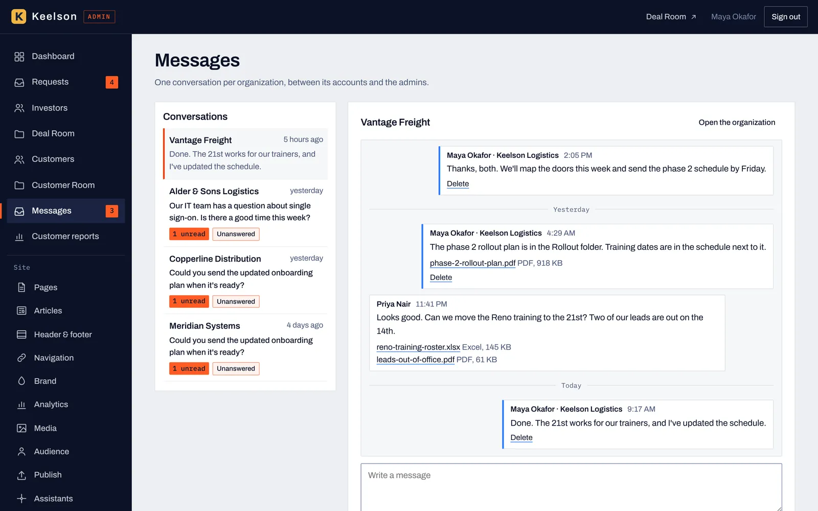
One conversation per organization, with unread and unanswered labels so a question doesn't wait a week.
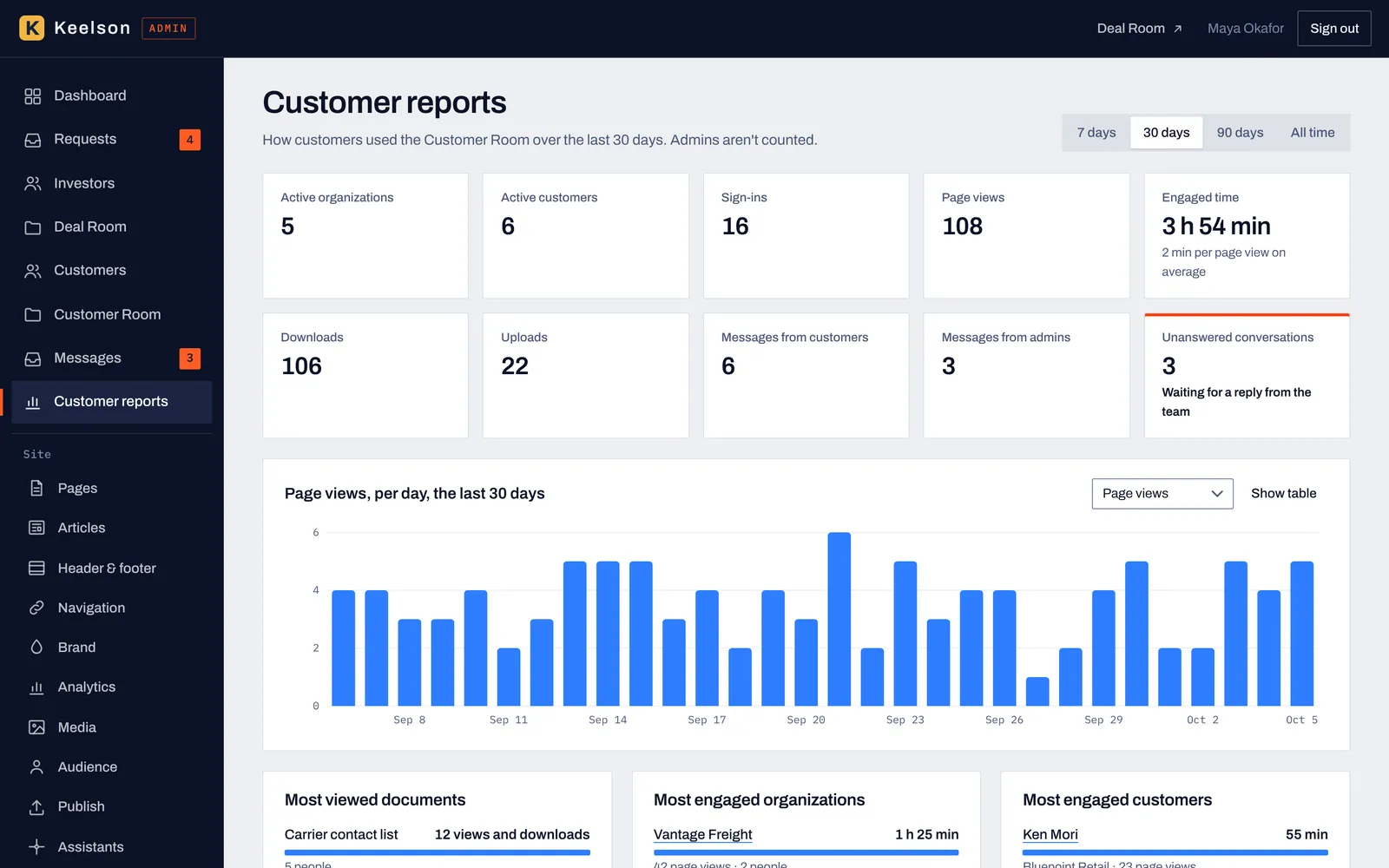
Active accounts, sign-ins, page views, downloads, uploads and the conversations waiting on your team, for 7 days, 30 days, 90 days or all time.
The Deal Room, the Customer Room, the library and the MCP are all part of the same price.
| Area | What you get |
|---|---|
| Site and editor | Pages and articles, a visual editor that adjusts to tablet and phone screens, header and footer, navigation, brand settings, a media library, drafts, checkpoints, publish and restore |
| Library | 58 section templates in 9 groups, 67 elements in 10 groups, 3 page starts, 4 article layouts and saved blocks |
| Audiences | Per-block visibility for everyone, signed-in members, people who aren't signed in and groups such as customers and investors, checked on the server |
| Bring your own AI | The VectorCanvas MCP for Claude Chat, Claude Code, ChatGPT, Codex, Gemini and other MCP clients, with read, draft and publish permissions per connection |
| Deal Room | Access requests, approvals, end dates, folders, revisions, engagement by investor and by document, and CSV export |
| Customer Room | Per-account documents, customer uploads up to 20MB per file, messages, invoices and usage reports |
| Search and AI visibility | Page titles and descriptions, social images, sitemap, structured data and publish checks |
| Analytics | Page views, reading time, downloads, sign-ins and clicks, with an optional Google tag and settings for visitor consent |
| Accountability | An activity log that names the person and the assistant for every change |
VectorCanvas is a website CMS for startup founders and small B2B companies. It includes a visual editor, a library of 58 section templates and 67 elements, an investor Deal Room, a Customer Room where customers can upload files, and an MCP connection that lets the AI assistant you already use build and edit your site.
Claude Chat, Claude Code, ChatGPT, Codex and Gemini can connect through the VectorCanvas MCP, and so can other assistants that support remote MCP servers. You approve each connection and choose what it may do.
VectorCanvas works with the AI subscription you already pay for. You connect your assistant to your site, and it builds and edits pages using what it already knows about your company. VectorCanvas doesn't resell AI usage, so there are no AI credits to buy here.
By default an assistant reads your site and saves its changes as drafts, and a person on your team reviews and publishes them. You choose what each connection may do, you can disconnect it whenever you want, and the activity log lists the assistant next to the person who connected it.
Investors ask for access from your site, you approve or deny each request, and approved investors open a room of folders and documents in the order you set. You can end each investor's access on a date you choose, and you see views, reading time and downloads by investor and by document. VectorCanvas doesn't verify that an investor is accredited.
The Deal Room is for investors: they request access, you approve them, and they read the documents you share. The Customer Room is for customers: each customer account gets its own space with documents, a message thread with your team, invoices and file uploads, and accounts are invited, so it has no request form.
Yes. Customers upload files from their Customer Room, up to 20MB per file. Each file lands in a folder for that account, and your team sees it in the admin.
Pages are built from blocks. The library has 58 section templates in 9 groups, 67 elements in 10 groups, 3 page starts for About, Product and Contact pages, and 4 article layouts. You can save any block to reuse it on other pages.
Yes. Each block can be shown to everyone, to signed-in members, to people who aren't signed in, or to groups you set up, such as customers or investors. Blocks marked for a group are removed on the server before the page is sent, and you can preview the page as each audience before you publish.
Each page has its own title, description, address and social image. When you publish, VectorCanvas builds a sitemap, keeps open rooms out of search results and adds structured data for your organization, pages, breadcrumbs, articles and FAQs. Images need alt text unless you mark them decorative.
Yes, for edits you need to make away from your desk. On a tablet or phone the editor stacks the canvas above the settings and uses larger touch targets, though a laptop gives you more room for a long session. You can also preview any page at phone, tablet or desktop width, and as any audience, before you publish.